Brand strategy.
Brand management.
Branding.
Art direction.
Media buying.
Content & photography.
Studio services.
Packaging design.
Out of register, on purpose.
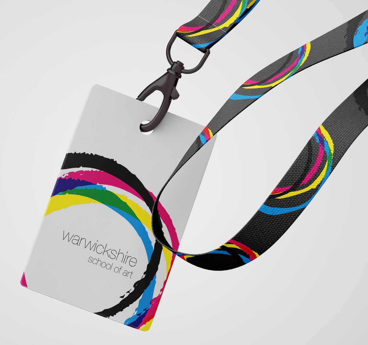
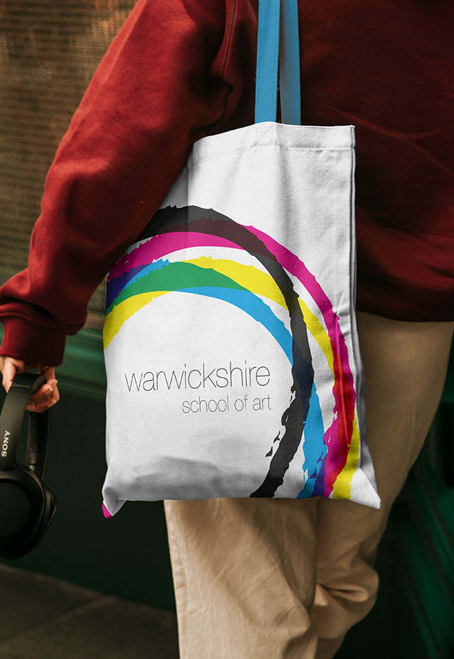
An art school’s identity should feel made, not manufactured. For Warwickshire School of Art, we built the brand from the raw materials of print. Four hand-drawn rings in cyan, magenta, yellow and black overlap without ever quite lining up, like a press sheet caught mid-registration.
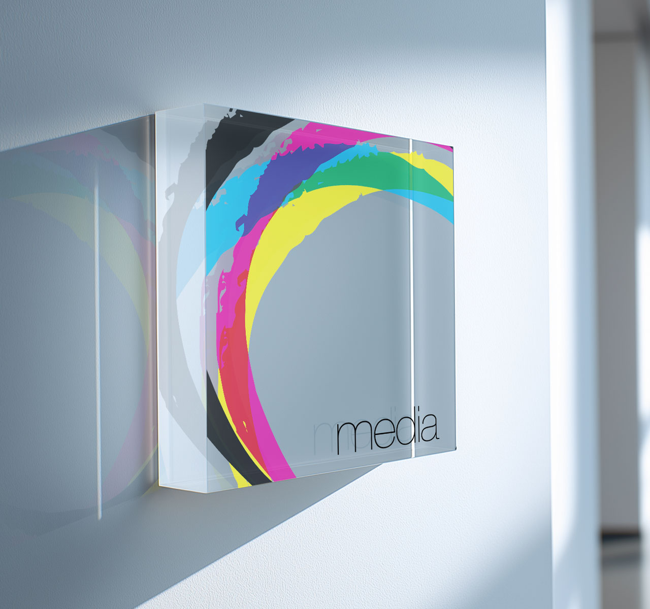
The CMYK rings form the master identity. On top of them sits a set of RGB brand layers that gives each department its own colour. Print colour and screen colour, the two languages every art student now works in, become one system, so the school reads as one place and each course still has a voice of its own.
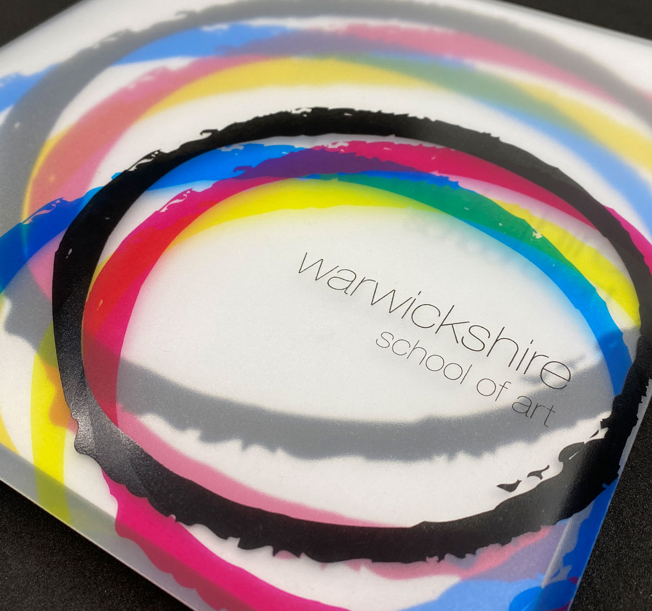
The identity came off the screen and into people’s hands through the prospectus. Each one was sent in a polypropylene envelope, UV screen-printed so it’s tough, tactile, and unmistakably from an art school.