Walk through any high street, scroll your social feed, or browse a supermarket shelf, and you’ll see it: the crisp, clean lines of sans serif type. From global giants like Apple and Google to minimalist indie startups, sans serif fonts have become the go-to choice for brands looking to project clarity, confidence, and modernity. But this isn’t just a passing trend—it’s the latest chapter in a typographic journey that stretches back over a century.
So, why are brands still so obsessed with sans serifs? To understand that, we need to go back to where it all started.
A Brief History of the Sans Serif
The roots of the sans serif typeface stretch back to the early 19th century, but they didn’t become mainstream until the early 20th century. In the wake of industrialisation and modernist thinking, designers began to strip away ornamentation in search of pure, functional forms. Sans serifs were the typographic equivalent of this new mindset—clean, rational, and geometric.
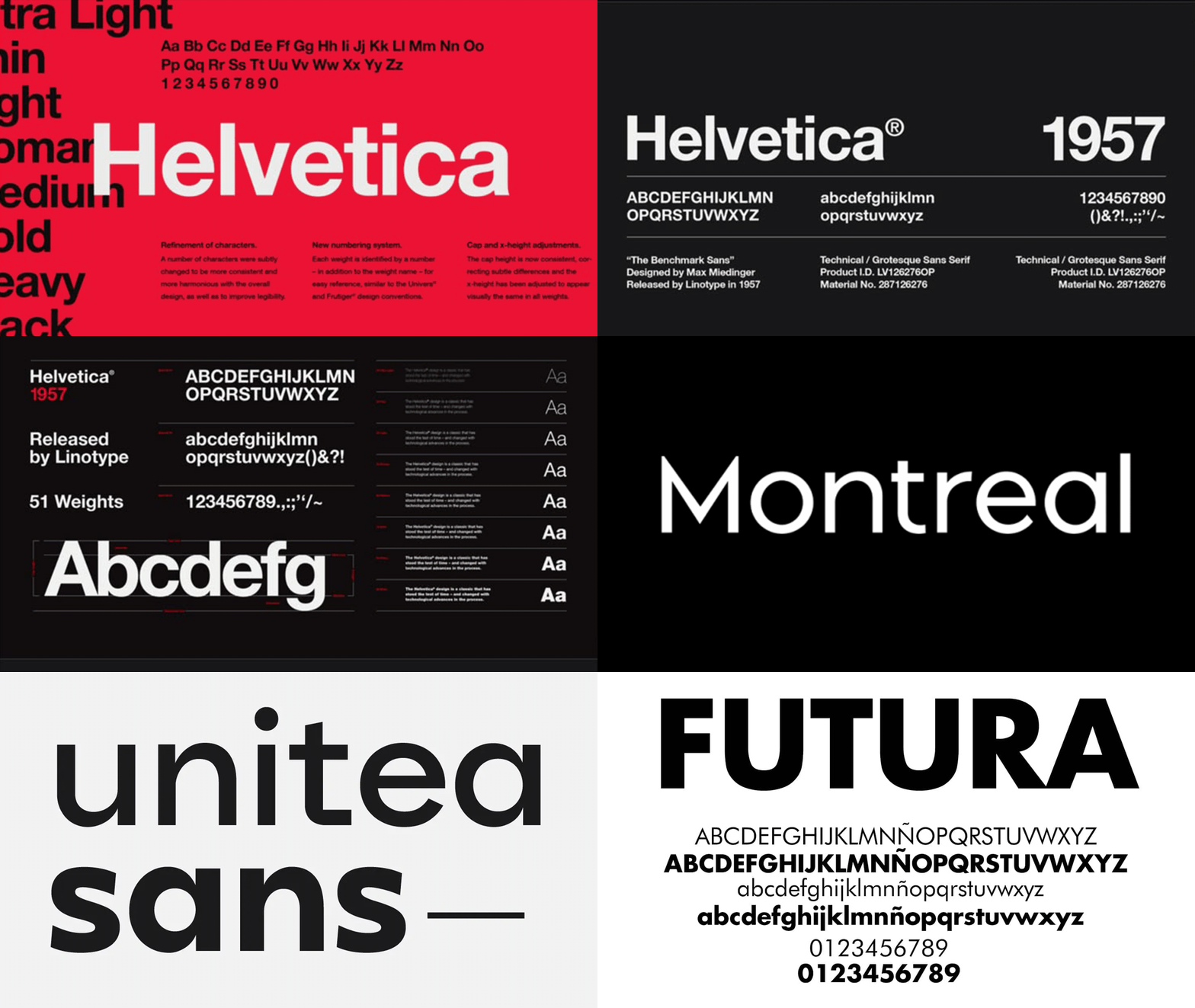
The Bauhaus school in Germany played a pivotal role in establishing this new design language. Type was no longer decorative; it was a tool for communication. Paul Renner’s Futura (1927) embodied these ideals perfectly: a geometric sans serif built on circles, triangles, and straight lines, intended for clarity and universality.
Then came the Swiss Style, or International Typographic Style, of the 1950s and ’60s. Designers like Josef Müller-Brockmann and Armin Hofmann used grid systems, photography, and sans serif typefaces—most notably Helvetica—to create bold, legible layouts. Helvetica wasn’t just a typeface; it became a symbol of modernist precision. Its neutrality made it an ideal carrier for global messages—no fuss, no flourish, just form and function.
Enter the Brand World
Fast forward to the late 20th and early 21st century, and sans serifs began to dominate corporate branding. In a fast-moving world, brands needed to communicate quickly and clearly across multiple platforms: print, digital, mobile, packaging, signage—you name it. Sans serif fonts were flexible, readable, and scalable. Crucially, they looked good everywhere.
Tech companies were among the first to lean into this. Google redesigned its identity in 2015 with a custom sans serif, abandoning its serif roots for a geometric, childlike simplicity that felt open and accessible. Facebook, Spotify, Airbnb, and countless others followed suit.
Even heritage brands have stripped back their typography in the last decade. Burberry, Balenciaga, and Yves Saint Laurent all ditched their classic serif logotypes in favour of stark sans serifs—a move that sparked both admiration and backlash. But the message was clear: clean type equals modern relevance.
The Psychology Behind the Simplicity
Sans serifs carry a quiet authority. They don’t shout; they state. Their stripped-back nature suggests honesty, openness, and directness. In a world saturated with information, brands need to cut through the noise—and sans serifs offer a clean slate.
They also offer neutrality. A well-designed sans serif doesn’t carry the baggage of a serif’s heritage or the eccentricity of a display face. It can be moulded to suit any tone—from tech startup to health brand to high fashion.
And let’s not ignore the digital factor. On screens, especially small ones, sans serifs simply perform better. They’re easier to read at small sizes, especially in UI environments. As more brand interactions happen on mobile devices, web apps, and social platforms, the sans serif becomes not just a style choice, but a usability one.
Today’s Sans Serif Landscape
We’re now seeing a more nuanced approach to sans serif typography. The pendulum may have swung a bit too far into blandness in the 2010s—leading to the so-called “blanding” of brand identities—but designers are fighting back with custom typefaces that add subtle personality without sacrificing clarity.
Type foundries and studios are pushing the genre further. Fonts like GT America, Söhne, Space Grotesk, and Graphik nod to the past but feel engineered for the digital age. They’re not just neutral—they’re intentional. Their quirks are deliberate, their rhythm carefully tuned for screens, motion, and interaction.
Custom sans serifs are now common in rebrands, not just to stand out visually but to own a piece of the brand’s voice. Think of Dropbox’s Sharp Grotesk, IBM’s Plex, or Netflix Sans—each tailored to speak directly in the tone of the brand, not just look good doing it.
The Future Is (Still) Sans
So where does it go from here? Sans serif typography isn’t going away anytime soon, but we are entering a more expressive era. The challenge now is to use the genre creatively—to find those subtle edges, the personality in the spacing, the humanity in the geometry.
Because great branding is about balance: clarity without coldness, simplicity with soul. The best sans serif fonts help brands walk that line. They’re not just clean—they’re confident. Not just modern—they’re meaningful.


